Design Systems
Thoughts & Cases

⤿

Designing Solar Systems

What started as a simple hunt for a “single source of truth” grew into something much bigger. Over the years, I’ve helped brands like DHL Group and Carlsberg Group turn messy pattern libraries into fully-fledged, multi-brand design systems. Along the way we bridged code and design, built scalable UI libraries, and shaped a global Figma toolkit that keeps everything in sync. 

/* More Info 
m-logo-small2 m-logo-small2
My role 
Creative Direction, DesignOps
 
Agency
Publicis Sapient

 
CASE DESIGN SYSTEMS 00103

Unified yet Flexible ⎯ one foundation serving multiple brands

The goal was to achieve consistency and efficiency across products while allowing every brand to maintain its unique visual voice. As Design System Lead, I directed the design team and defined the overall system architecture, governance model, and Figma infrastructure. My role combined strategy and hands-on delivery — bridging UX, UI, Development, Product, and Brand to ensure alignment across all disciplines, vendors, and stakeholders. The result: a scalable, modular platform that enables faster rollouts, cohesive user experiences, and creative autonomy across a multi-brand ecosystem.
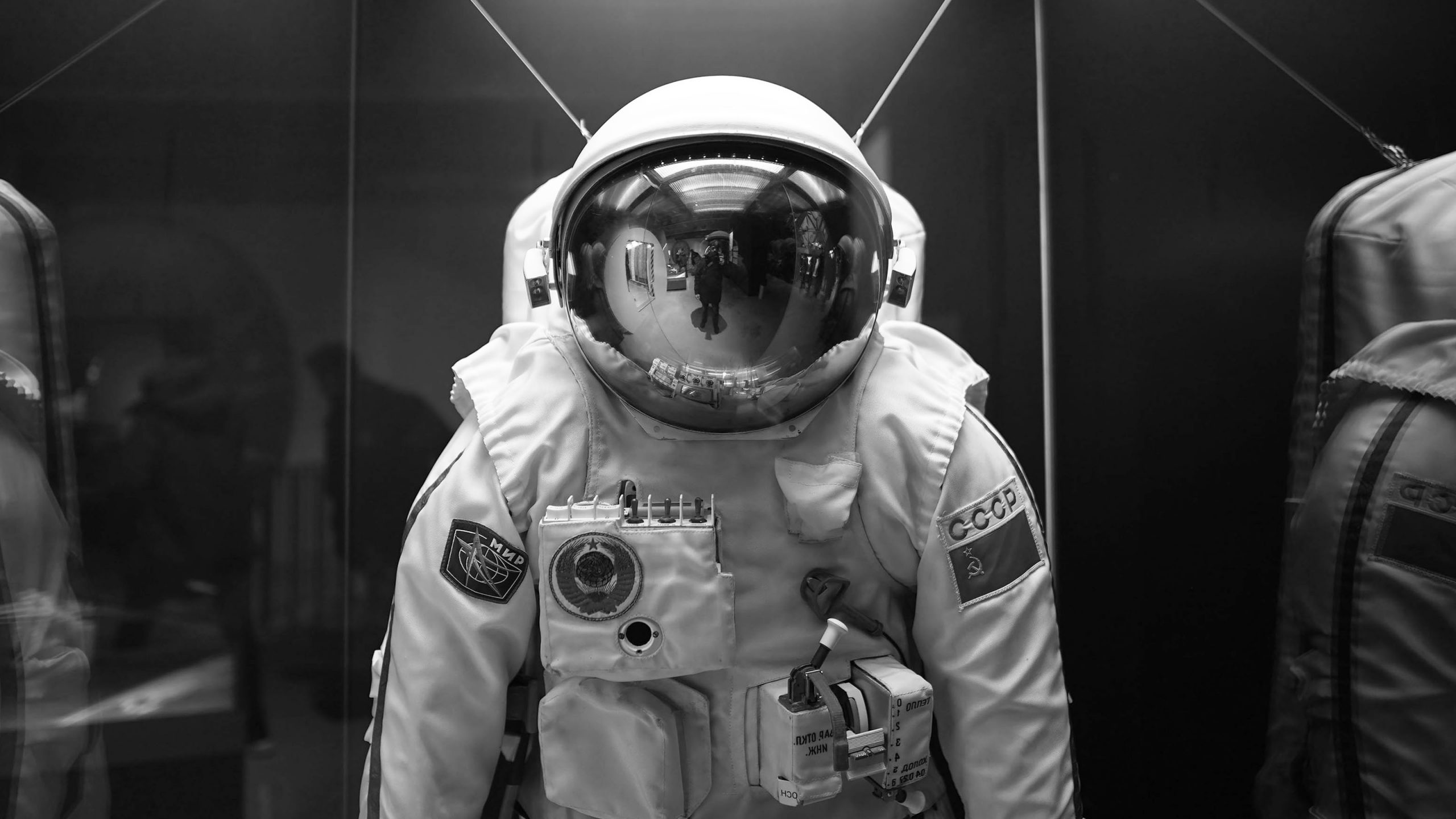
CASE DESIGN SYSTEMS 00101

Building a design system is more than defining components, it’s about connecting disciplines, tools, and people around a shared vision. Each layer (from build to consumption) plays a role in turning structure into speed. The following sections outline the principles that shaped this transformation, showing how to create one source-of-truth.

/* Designing Collaboration ⎯ A System Built by All Disciplines
A multi-brand design system can only succeed through true cross-disciplinary collaboration. From the start, the team was structured around shared ownership — bringing together designers, developers, product leads, and brand stakeholders in one continuous workflow. I established a governance and co-working model that replaced linear handovers with parallel collaboration. Design and development worked in sync, with clear roles, defined responsibilities, and agile feedback loops. Regular reviews ensured each discipline contributed to a shared source of truth while keeping pace with delivery goals. As design lead, I managed the team structure, alignment, and approvals, ensuring transparency between creative, technical, and strategic streams. This foundation created a culture of open collaboration — the key driver behind the system’s scalability and adoption.
/* A Shared Foundation ⎯ Scalable by Design
The design system was built on a layered architecture that balances unity and flexibility. At its core lies a shared foundation of tokens, core components, and accessibility rules that define the visual and functional language across all brands. On top of this base, individual brand layers extend and theme these foundations, introducing unique color palettes, typographic voices, and motion behaviors without compromising consistency. This modular setup allows new brands and products to be introduced quickly, each inheriting the same backbone while expressing its own personality. The result is a system that scales effortlessly — one that grows with every new brand instead of starting over each time.
/* Design Tokens ⎯ The DNA of a Multi-Brand System
Design tokens form the connective tissue between design and development — the smallest, most powerful elements of consistency in the system. Each token defines a decision: a color, a type scale, a radius, a motion curve. Together, they translate design language into data that can be shared, versioned, and scaled across brands and platforms. For the multi-brand setup, tokens were organized into a clear hierarchy separating core values from brand-specific themes. This structure allows each brand to express its individuality through dedicated palettes and styles while inheriting the same logic and technical framework. Using Figma Variables and token management tools, the system maintains synchronicity between design and code — ensuring every update cascades across products with precision and control.
/* From Structure to Speed ⎯ A Scalable Figma Ecosystem
A strong design system relies on a well-structured toolkit. The Figma setup was designed as an ecosystem of interconnected libraries — foundations, components, documentation, and sandbox environments — all governed by clear versioning and publishing rules. This structure enabled teams to work in parallel, experiment safely, and deliver with confidence. Every component was built on atomic principles, with variants and responsive behavior defined from the start. Documentation lived directly inside Figma, reducing friction between design and development and ensuring that guidelines evolved with the work. As design lead, I established the file architecture, component taxonomy, and release process — turning the toolkit into a living, maintainable environment that balanced creative flexibility with operational precision.
/* Governance That Scales ⎯ Clarity, Alignment, and Continuity
A design system is only as strong as the process that sustains it. From the outset, a clear governance model defined how decisions were made, documented, and approved across disciplines. Roles and responsibilities were mapped to avoid overlaps, while shared rituals — design reviews, token audits, and release checkpoints — kept progress transparent and predictable. The planning framework balanced speed with control: agile sprints for component delivery paired with structured reviews for quality assurance and stakeholder alignment. Acceptance criteria covered every angle — from UX behavior and accessibility to code integration and brand compliance. By establishing this rhythm early, the team could move fast without losing cohesion. Governance became more than oversight; it was the mechanism that kept creativity, consistency, and accountability in sync.
/* From Vision to Implementation ⎯ Turning System Thinking into Scalable Output
Once the foundations were set, the focus shifted to bringing the system to life — translating principles, tokens, and architecture into real, usable products. The workflow was built around iterative delivery: design and development worked in parallel, validating each component through hands-on testing, responsive checks, and accessibility reviews. Each release followed a consistent rhythm — from planning and build to validation and improvement — ensuring quality and cohesion across every touchpoint. As design lead, I oversaw this full cycle, coordinating across disciplines and guiding both creative and technical implementation. The result was a living ecosystem of components and brand themes, continuously evolving through feedback and iteration. Every delivery stren gthened the foundation, proving that a well-governed system can move fast without ever losing its integrity.
/* Scalable Impact ⎯ Systems That Grow Beyond Their Origin
The system delivered more than consistent design — it created alignment, efficiency, and shared ownership across disciplines. Teams could move faster, onboard new brands with less friction, and make confident decisions backed by clear structure and documentation. What began as a design initiative evolved into an operational framework that shaped how products were planned, built, and maintained. Leading this transformation reinforced a key insight: a design system isn’t just a set of components, but a living collaboration model. Success depends as much on governance and teamwork as it does on pixels and tokens. Each rollout refined the process, proving that when structure and creativity coexist, the system becomes not just scalable — but self-sustaining.
/* One System ⎯ Many Expressions
The visual outcome illustrates how a single foundation can adapt seamlessly across multiple brands and experiences. From core components to themed interfaces, each expression stays rooted in the same design logic — proving that structure and creativity can coexist. Diagrams, token hierarchies, and interface examples visualize the system’s evolution: a shared base expanding into unique brand worlds. This closing view captures the essence of the project — a design system built not just to unify, but to empower diversity through consistency.
CASE DESIGN SYSTEMS 00102

The principles shown here aren’t theoretical — they’ve been tried and proven across multiple global brands. Each project helped refine the system, shaping a process that balances creativity, structure, and collaboration. From brand theming to governance, from token logic to Figma infrastructure — I’ve built, led, and delivered these systems in real environments, with real teams, and real impact. And every new project adds to that foundation — smarter, faster, and more connected each time.

DHL Group, Germany
⎯ Active

As one of the world’s largest logistics networks, Deutsche Post DHL Group connects people and businesses across every border and timezone. Behind that promise — Excellence. Simply Delivered. — lies a complex digital ecosystem spanning products, platforms, and brands. Our task was to bring coherence to it all through a unified design system: a shared foundation of tokens, components, and principles that streamline collaboration between design and engineering. The result is a system built for scale — consistent, efficient, and unmistakably DHL.
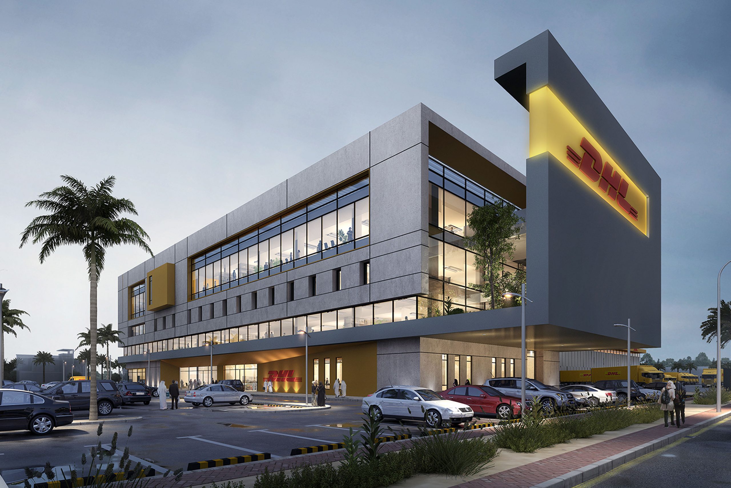
CASE DS CLIENTS0104

Carlsberg Group, Denmark
⎯ Active

From Copenhagen to the world, Carlsberg is more than a brewery — it’s a global portfolio of brands, each with its own voice, audience, and legacy. Our mission was to build a design system flexible enough to serve them all while keeping a shared DNA of craftsmanship and clarity. The system unites design and engineering through tokens, theming, and reusable components — creating consistency across digital products without diluting the individuality of each brand. A foundation that scales from flagship sites to local markets, brewed with the same attention to detail as the beer itself.
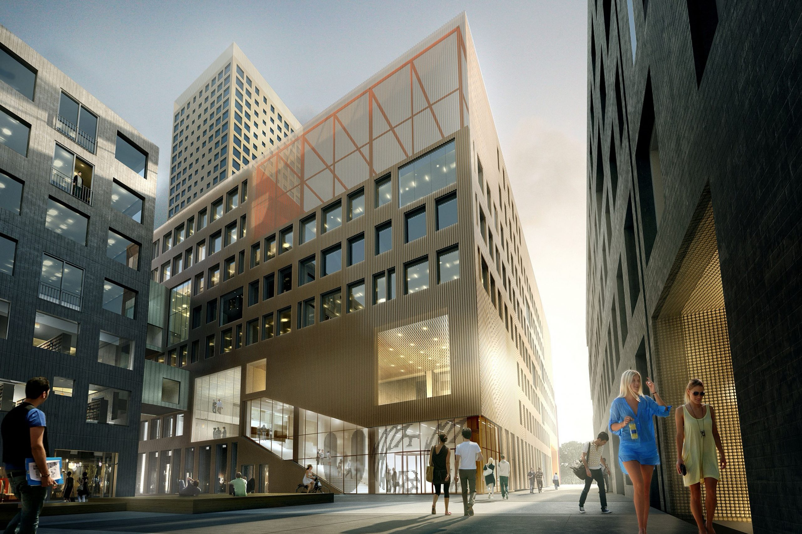
CASE DS CLIENTS0204

Diriyah Company, Saudi Arabia
⎯ In Progress

At the edge of Riyadh, Diriyah rises as a modern destination built around centuries of heritage — the birthplace of the Kingdom and a symbol of cultural rebirth. As part of this transformation, we’re shaping a multi-brand design system that connects Diriyah’s digital experiences under one visual and technical framework. From the first color token to full-scale documentation, the system brings consistency to every touchpoint — bridging design and engineering, tradition and innovation, the timeless and the contemporary.
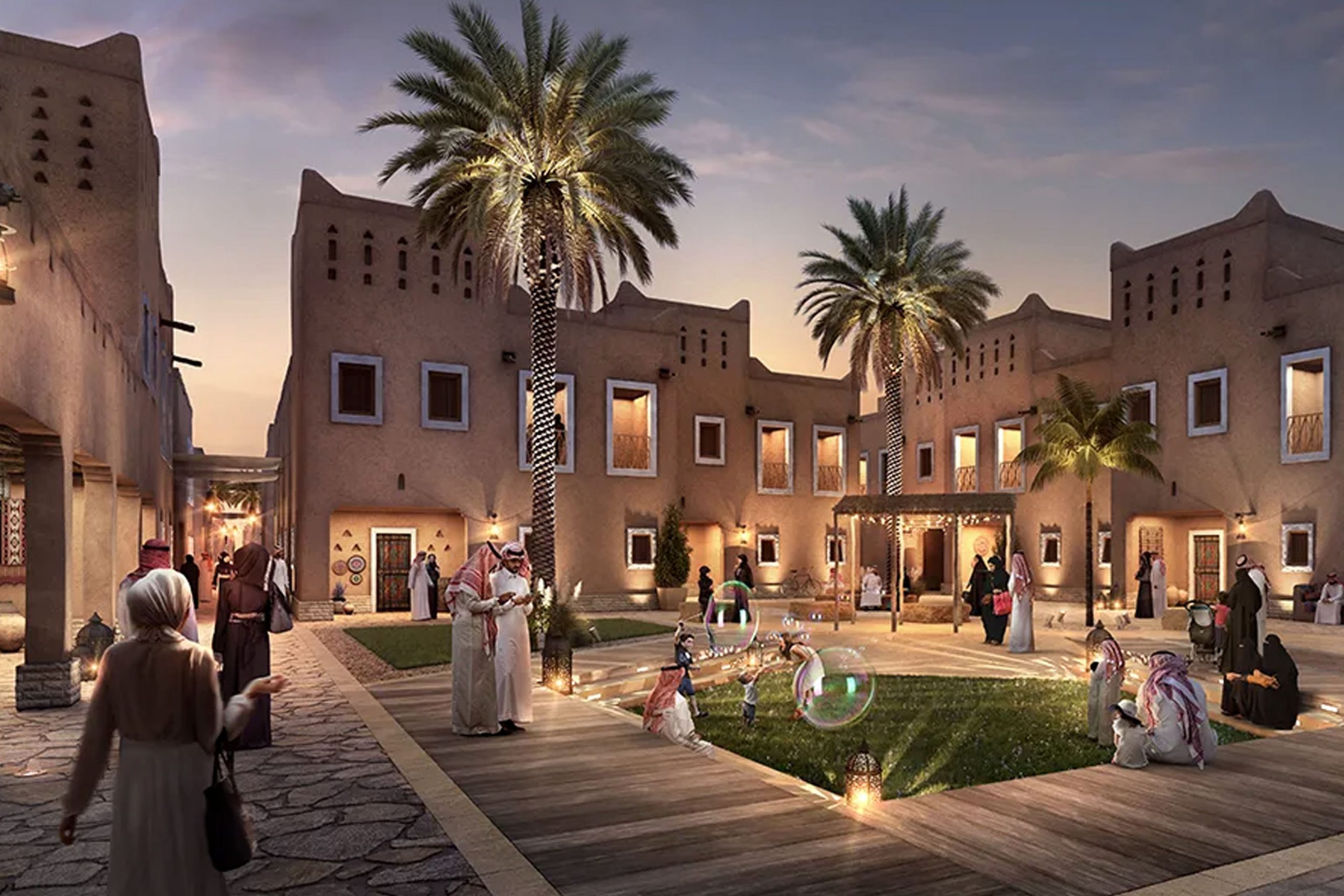
CASE DS CLIENTS0304