

DIGGICHECK – Digital Execution Readiness
DIGGICHECK is my own studio and product concept: a readiness check for websites. You enter a URL and see how ready the site is for AI discovery, automated production and digital experiences that scale.


Websites are built for people, but machines read them first. The scan starts from the existing URL, with no sign-up. A free overview scores the site out of 100 across Visibility, Clarity, Consistency and Performance, with ranked findings: what was found, why it matters, what to fix first. A detailed report adds evidence and priorities, and further services turn the brand into structured content.
WHAT IT SHOWS
Brand for machines: brand strategy turned into something AI systems can read.
Product end to end: name, identity, scan, results page, report and service model.
Reduction as principle: four colours, one typeface, only what helps understanding.
Audit to service: a free scan leads into a report
and further services.
MY ROLE
Concept, Naming, Branding, UX/UI Design,
Service Design
YEAR
2026
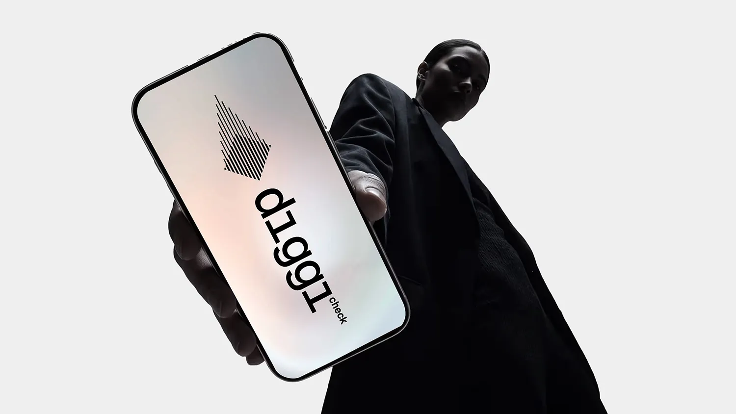
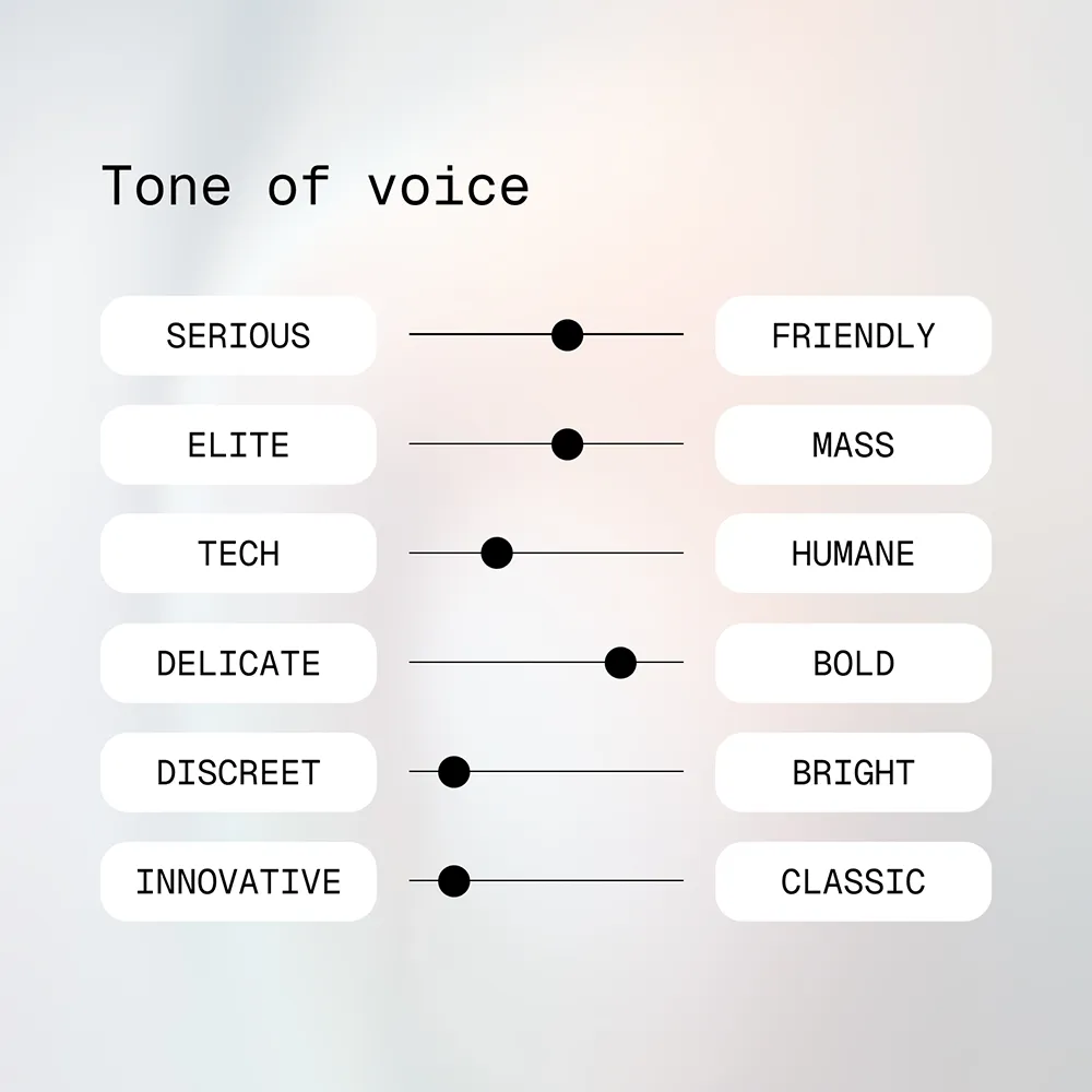
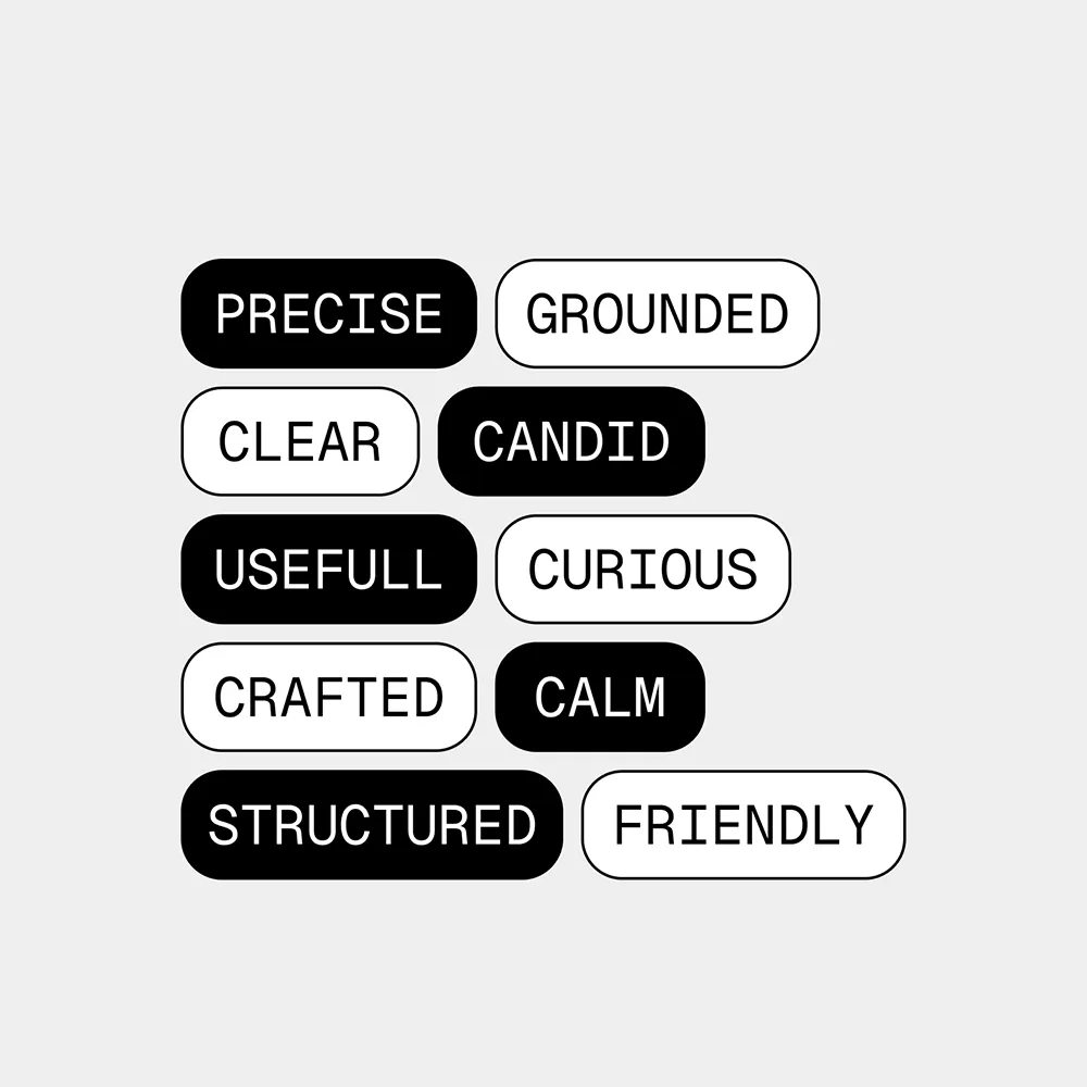
Brand Concept • DIGGICHECK should sound like a knowledgeable buddy who looks closely: precise and grounded, clear and candid, curious but calm. The tone is friendly without losing its seriousness, and open to everyone rather than exclusive. It leans technical, says things boldly but looks discreet, and is new rather than classic. Every word and screen has to be useful first and crafted second. That’s why the brand is monochrome and monospaced: nothing competes with the findings.
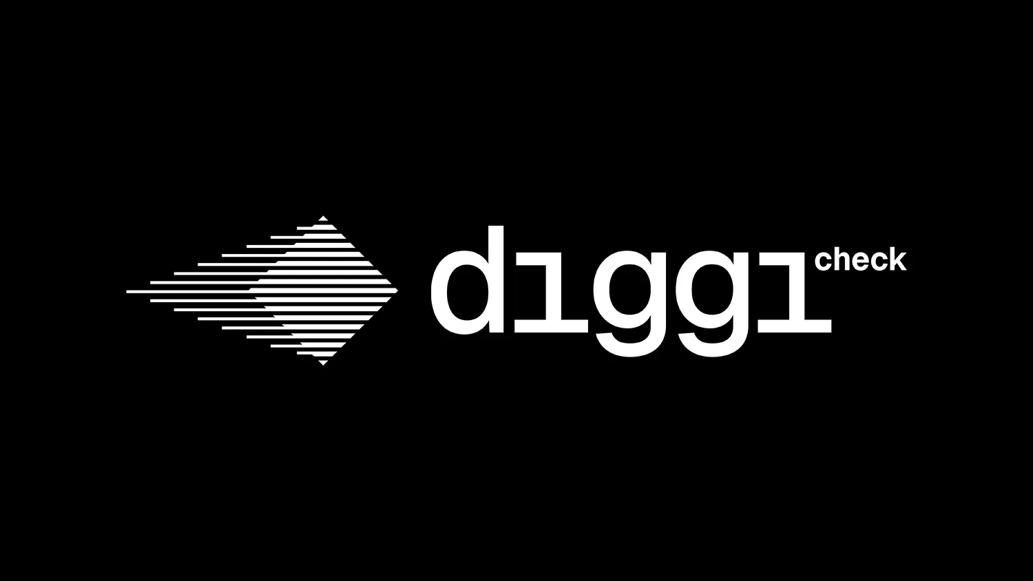
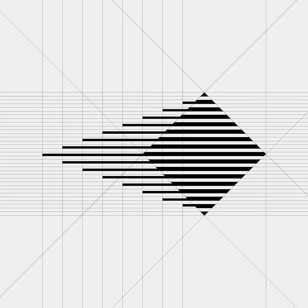
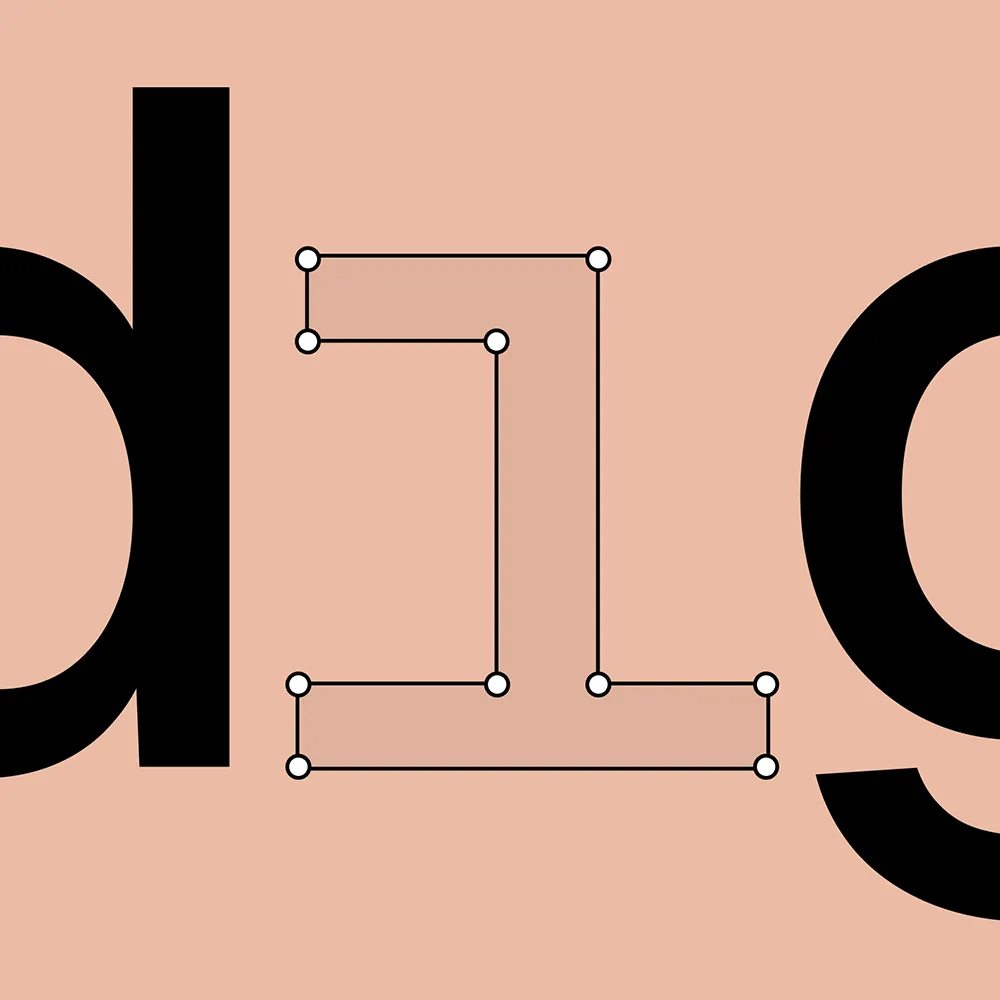
Logotype • “diggi” is German for buddy and sounds like digital. “check” says what the product does. The wordmark follows that order: “diggi” large, with dotless i’s drawn closer to a 1, and “check” small at the top right, like a label on a measurement. The symbol is built from horizontal lines that taper into a diamond, like a page being read line by line. It’s closer to a technical drawing than an app badge, because DIGGICHECK is there to look closely, not to decorate.
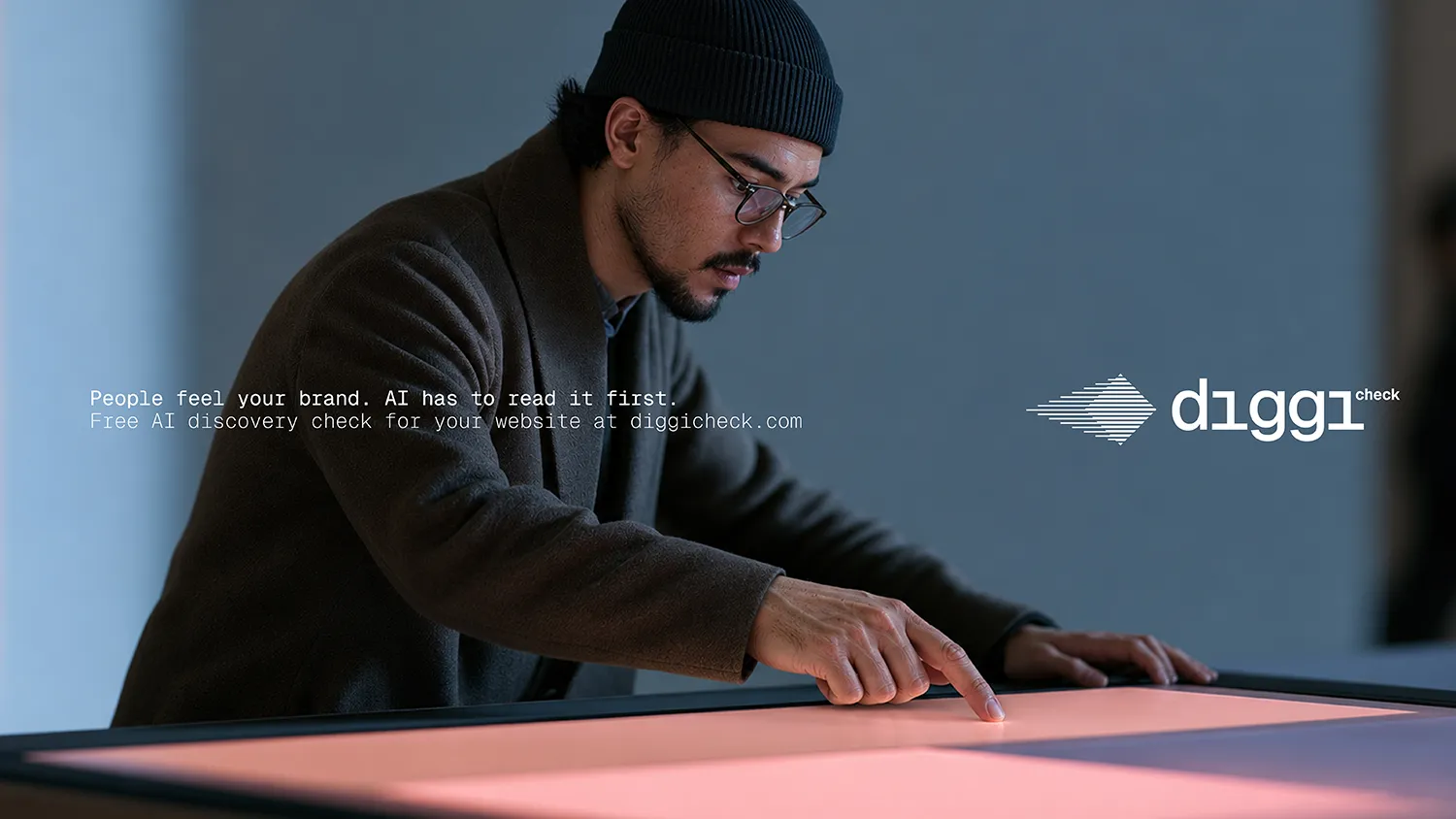
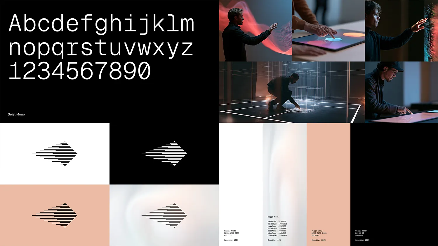
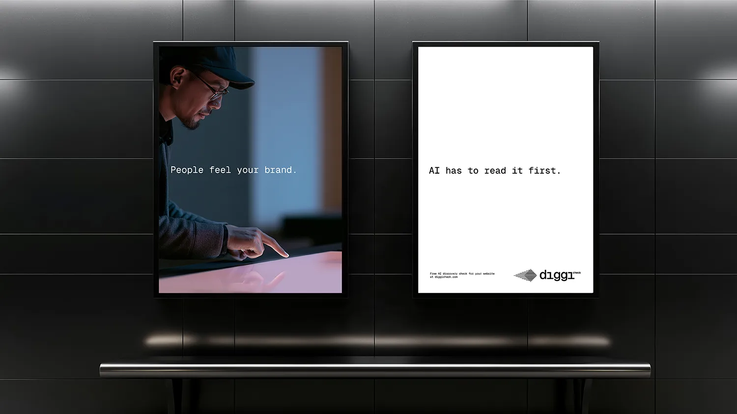
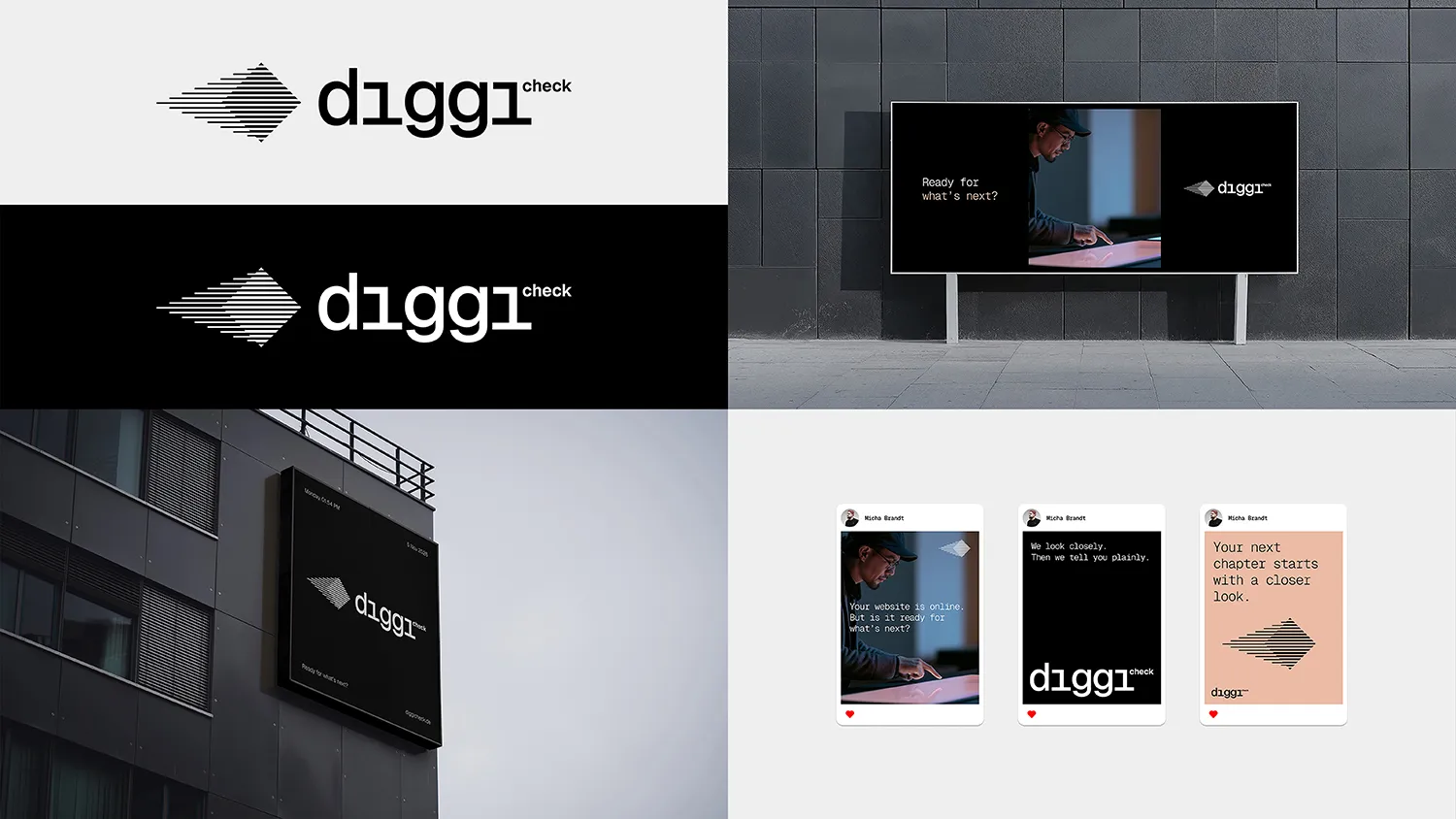
Brand Guidelines • Eight areas, from logo and typography to interface components and social media, all following one rule: reduce until only what helps understanding is left. Four colours run from Diggi White to Diggi Black, with Clay as the only warm accent. Geist Mono sets every word, and photography shows people looking closely, not posing.
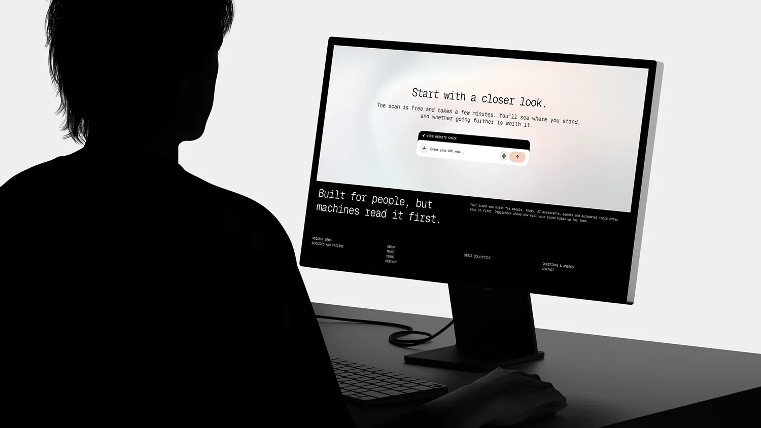
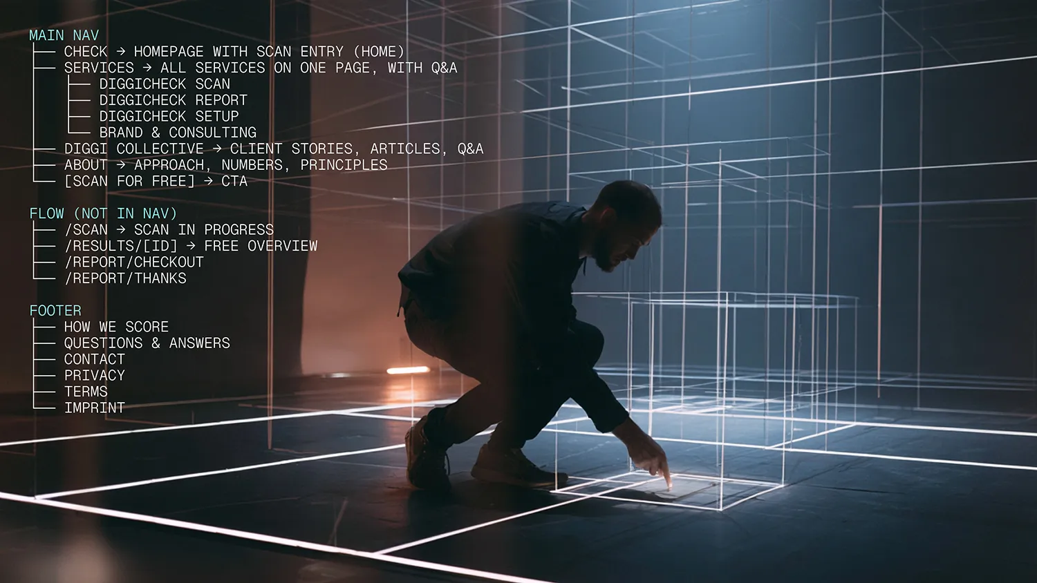
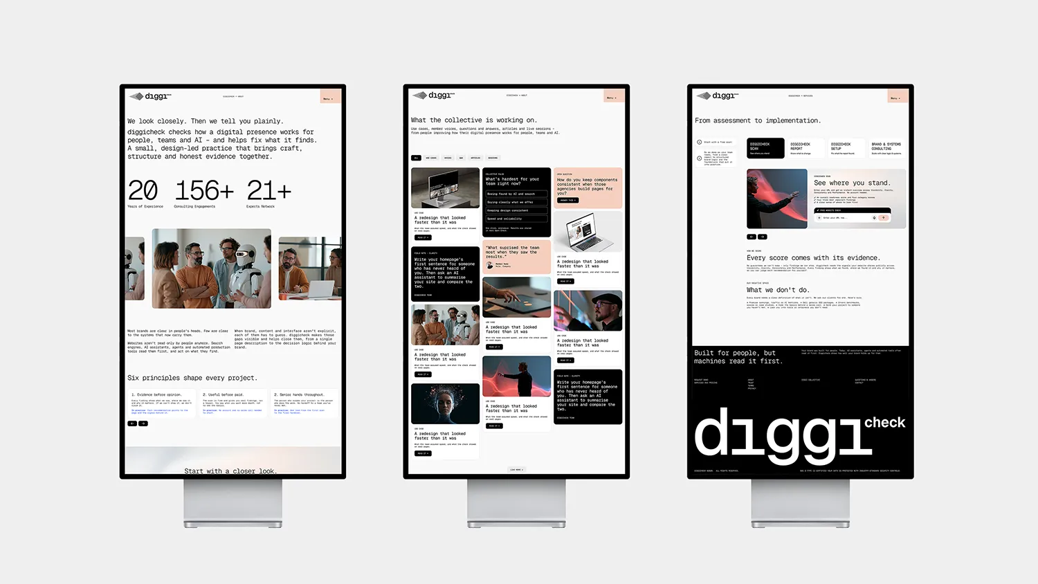
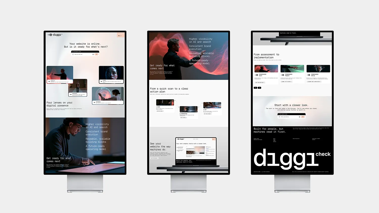
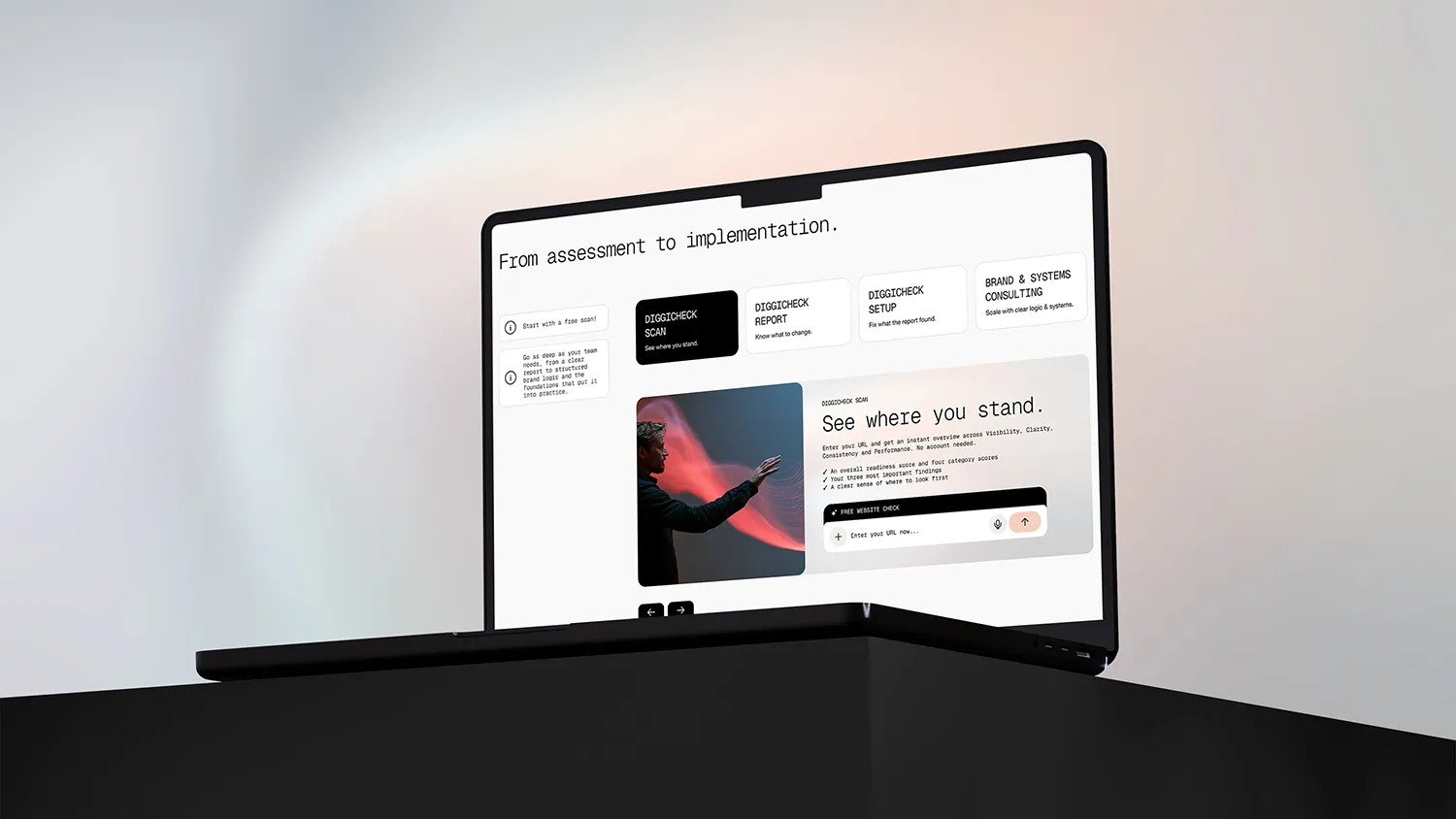
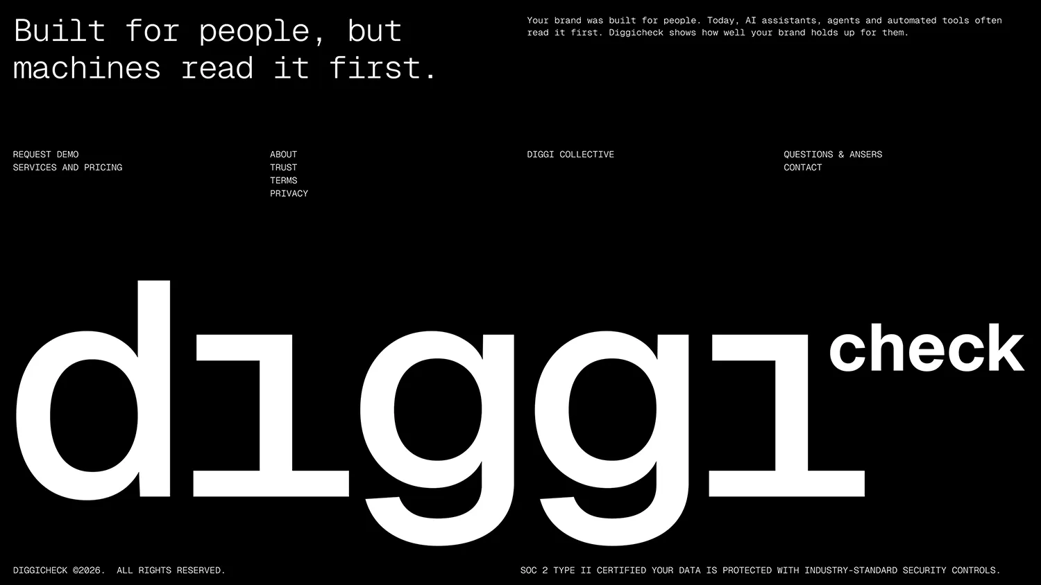
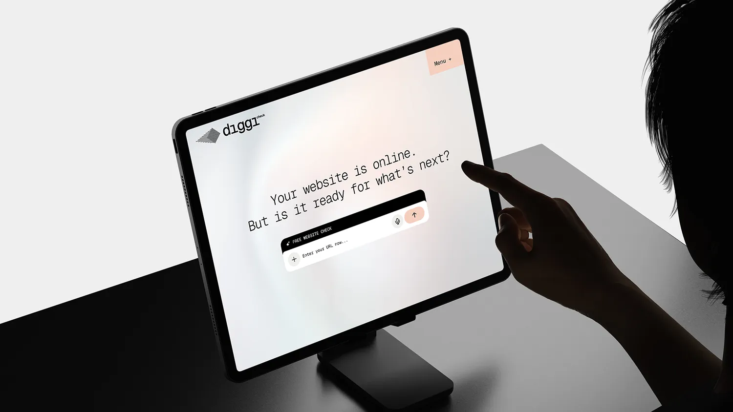
Website • The homepage opens with one question: your website is online, but is it ready for what’s next? The scan entry sits right there, with no sign-up in front of it. The structure stays flat: services and pricing on one page, then the Diggi Collective, the approach and Q&A. The footer closes with the line the brand is built on: built for people, but machines read it first.
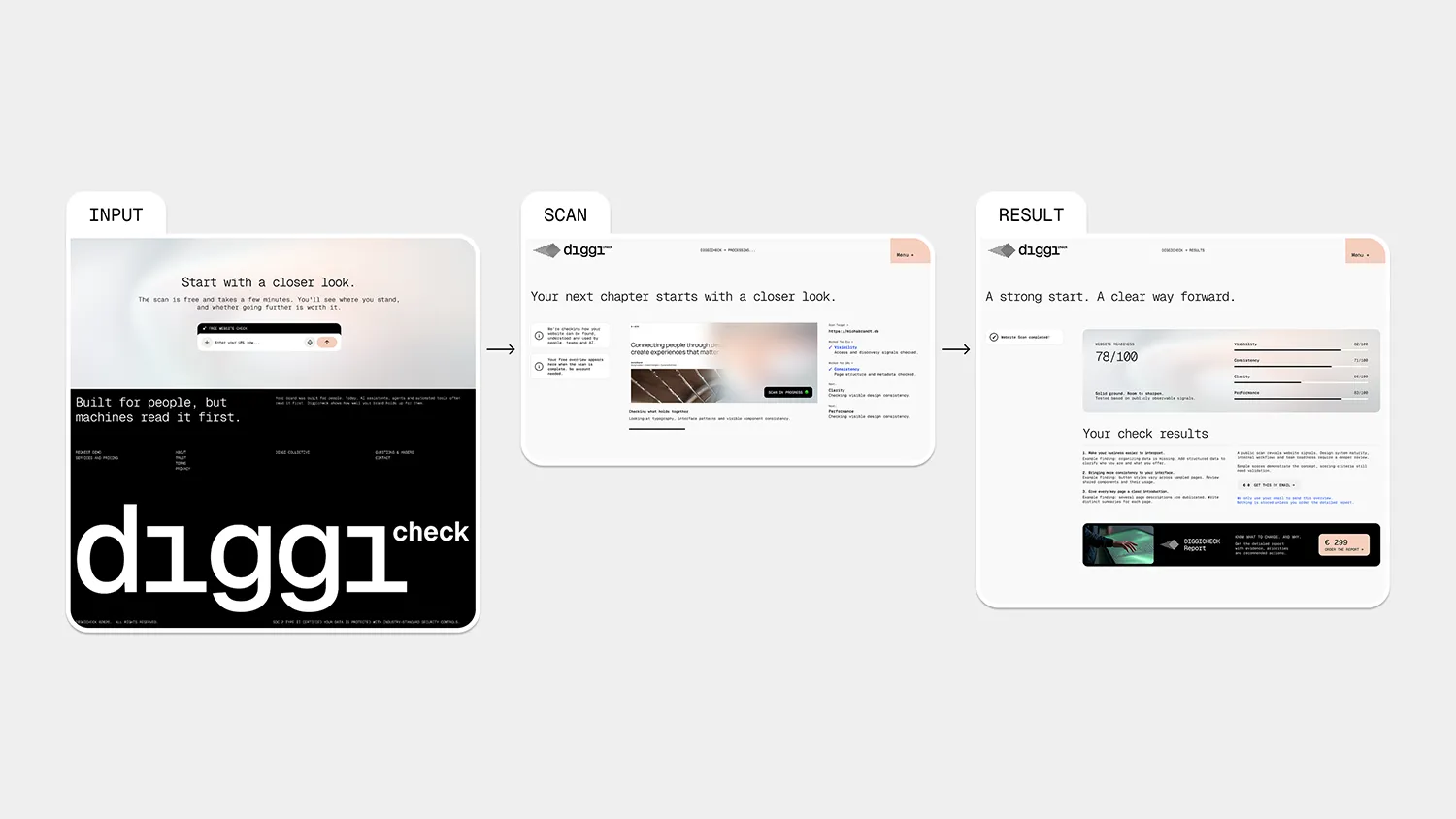
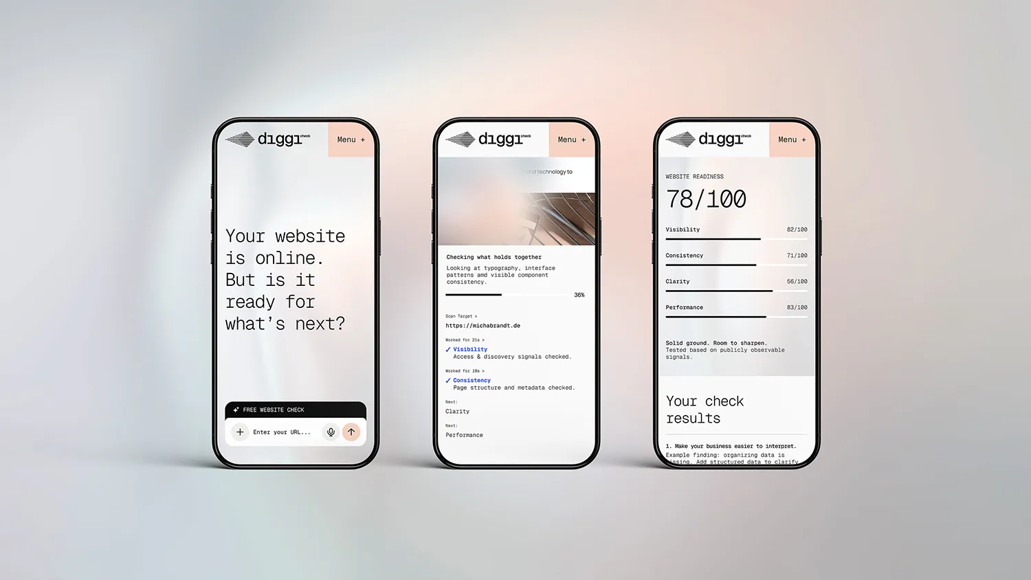
Scan & Results • The scanned website is the centrepiece of the results page, not a dashboard of charts. Each finding is ranked by impact and reads the same way: what was found, why it matters, what to fix first. The free overview stops at the point where a plan becomes useful, and the full report picks up from there.
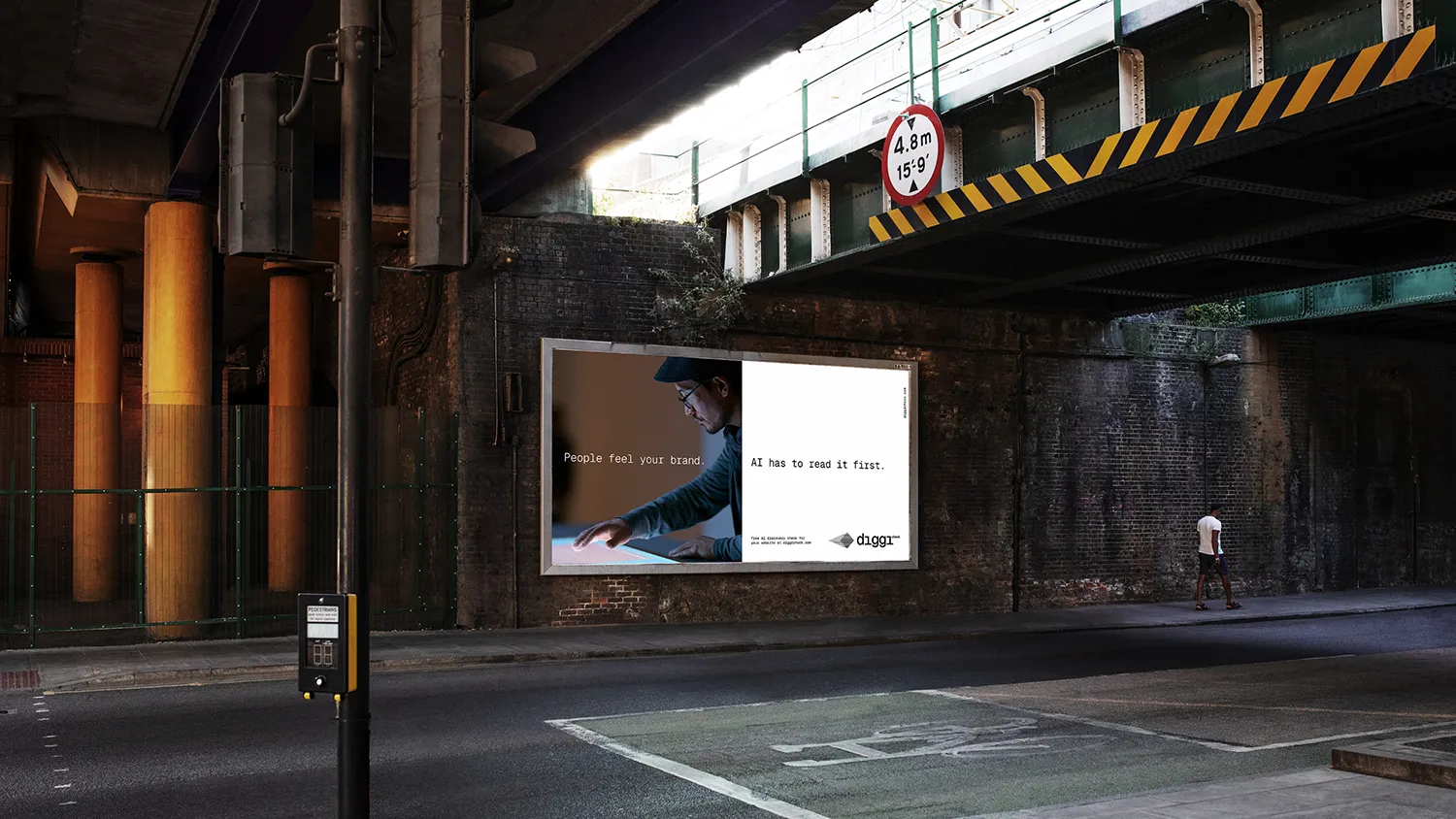
What’s Next? • DIGGICHECK is a concept, not a live product yet. Everything shown here explores how the idea could look, sound and work. The question behind it is real, though: most brands are still built only for people, while machines increasingly decide who gets found. If that sounds familiar, let’s talk.
©2026. All rights reserved.
