
Designing Solar Systems

Large organisations rarely lack design talent. They lack a shared foundation. For DHL, Carlsberg and Diriyah I replaced separate brand builds and scattered pattern libraries with multi-brand design systems that design and engineering both build from, so new brands, markets and products start from proven work.

↓ More Info
Element44 Element43
CONCEPT
Every brand and country team was solving the same interface problems alone, design and code drifted apart, and each new brand cost as much as the first. The answer is one foundation: shared core tokens plus brand tokens, components built once with variants, accessibility and documentation, a Figma toolkit connected to code, and governance with clear roles and checkpoints. Each brand changes only what makes it distinct.

WHAT IT ENABLES

One foundation, many brands: new brands plug in instead of starting over.
Design and code in sync: tokens turn design decisions into data both sides rely on.
Faster onboarding: teams start from a predictable, documented toolkit.
A shared operating model: design, development, product and brand work in one rhythm, without handovers.

MY ROLE

Design Systems Architect, Design Lead, DesignOps

YEAR

2020–today

case designsystems 008

Not just a toolkit... it's a solar system you build. 

You define the core, set the gravity, and bring UX, UI, Development, Product, and Brand into one orbit. When everything aligns, teams move faster, stay connected, and still have space for each brand to shine.

The real work starts once the foundation is set – the thinking, the structure, and the routines that turn a system from theory into something teams rely on every day. The sections below unpack how that happened: how collaboration was shaped, how tokens became the glue, and how the toolkit grew into a fast, predictable way of working.

Designing Collaboration
Element44 Element43
The system only worked because everyone built it together. Designers, developers, product, and brand moved in one rhythm – no big handovers, just parallel work, open reviews, and clear roles. My job was to keep that flow steady and transparent, making sure decisions and conversations didn’t get lost between disciplines. Over time, that way of working turned collaboration into the real engine behind the system’s scale and reliability.
A Shared Foundation
Element44 Element43
We created one solid base – tokens, components, accessibility rules – and let the brands layer their own voice on top. Same backbone, different personalities. That modular setup meant each new brand plugged into the system without reinventing anything. It kept quality consistent while giving teams room to express their identity, making expansion feel natural instead of labor-heavy.
Design Tokens – The DNA
Element44 Element43
Tokens kept everything connected. They turned design decisions into data that both design and code could trust, removing guesswork across teams and vendors. Core tokens stayed universal; brand tokens added individuality where it mattered. With Figma Variables and proper tooling in place, updates rolled through the system cleanly, keeping every experience aligned without slowing down delivery.
From Structure to Speed
Element44 Element43
The Figma setup became its own ecosystem: foundations, components, docs, and sandboxes – all cleanly organized and versioned. Components were built with variants, responsive behavior, and documentation baked in from day one. Designers could pull from a predictable toolkit, experiment safely, and ship faster. The structure didn’t limit creativity – it removed friction so teams could focus on the work that mattered.
Governance That Scales
Element44 Element43
Good governance kept everything steady. Clear responsibilities, predictable rituals, and shared checkpoints kept quality high without bogging the team down. It wasn’t about approvals for the sake of approvals – it was about rhythm and clarity. This structure made the system easier to maintain, helped decisions land faster, and kept everyone moving in the same direction.
From Vision to Implementation
Element44 Element43
Once the base was set, we moved into continuous delivery. Design and development worked side-by-side, testing, refining, improving. Each release reinforced what came before and opened space for the next iteration. It became an ongoing loop – build, check, adjust – keeping the system alive, coherent, and always improving without massive rework cycles.
Scalable Impact
Element44 Element43
The system didn’t just tidy up design; it reshaped how teams worked. Onboarding sped up, decisions got clearer, and brands could ship faster with fewer dependencies. What started as a design initiative evolved into a shared operating model. It proved that when structure supports creativity instead of controlling it, the whole organization moves with more confidence.
One System – Many Expressions
Element44 Element43
The final output showed how one foundation could stretch across very different brand worlds without breaking. Same design logic underneath, unique expressions on top. The visuals made the whole idea tangible – unity where it matters, freedom where it counts – and a system built to support both.
Value of a Shared System
Element44 Element43
Every brand, page, and product that starts from scratch pays for the same decisions twice. A shared foundation changes that. Tokens, components, and patterns become reusable infrastructure instead of one-off work, and the return grows as more teams and brands build on top of it.

The value compounds in four ways as a system matures from foundation to full adoption (modeled ranges):

30–50% less design effort – shared foundations replace repeated UI decisions across brands and teams.
20–30% higher development output – tested components & clearer design-to-code handover speed up build cycles.
25–40% less rework and QA effort – shared standards and reusable assets cut inconsistencies and correction cycles.
30–50% faster rollout potential – new brands and products launch from an established system instead of starting cold.

The principles here aren't theory

They’re shaped by real work across global brands.

Each project refined the balance between creativity, structure, and collaboration, from brand theming to governance, from token logic to Figma infrastructure. I’ve built and led these systems in live environments with real teams and real impact – getting smarter every time.
case designsystems 005

Global Logistics & Connectivity Leader, Europe

Status: Active

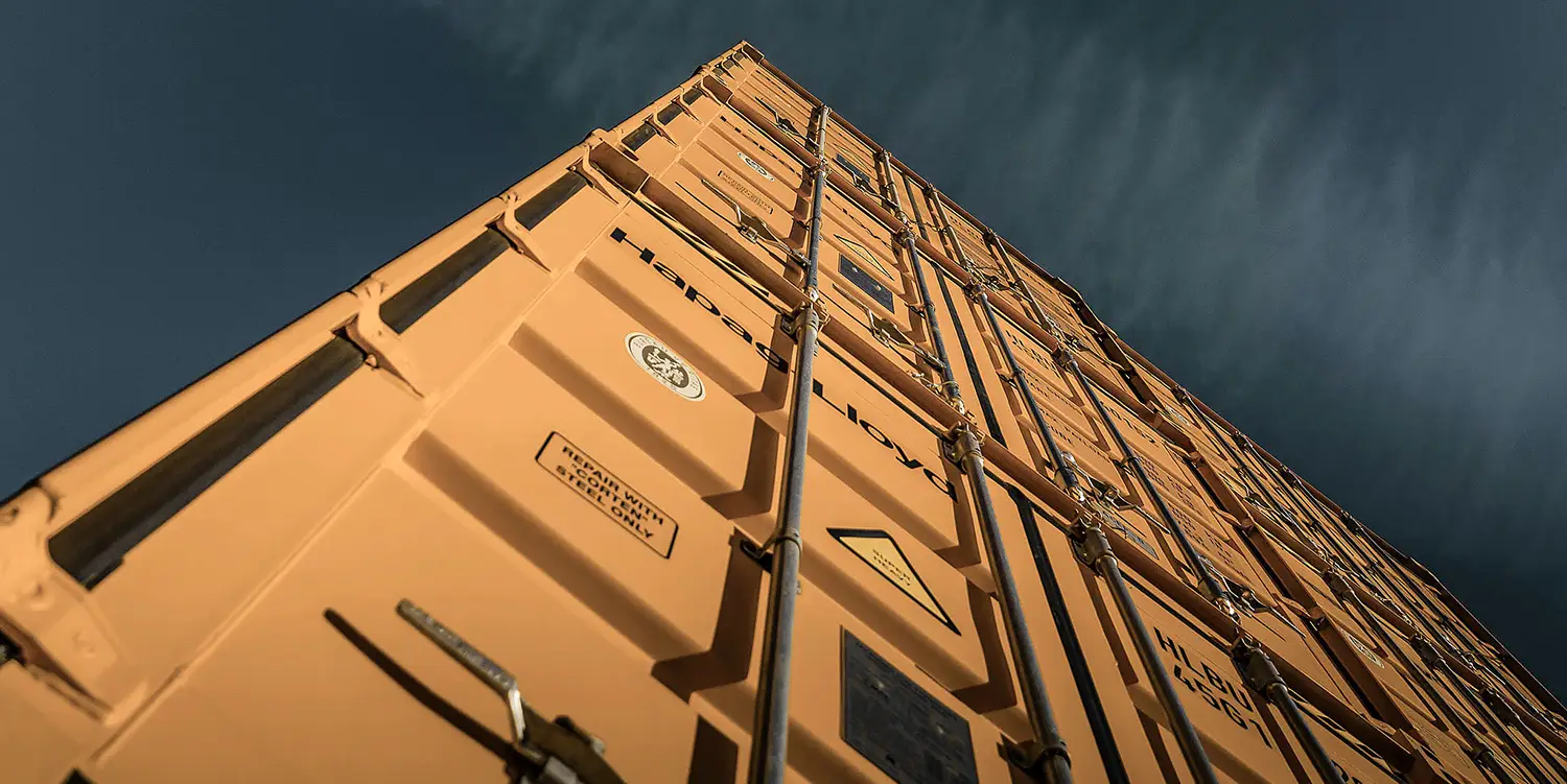
One design system and content toolkit for a global web platform with more than 140 country sites. Shared principles, reusable components, documented workflows and a Figma library, plus content guidelines so brand, content and digital teams work in one language. A governance model lets business units contribute without fragmenting the system. I was design lead and architect, building it from zero with business units worldwide.
case designsystems 007

Global Beverage Group, Northern Europe

Status: Active

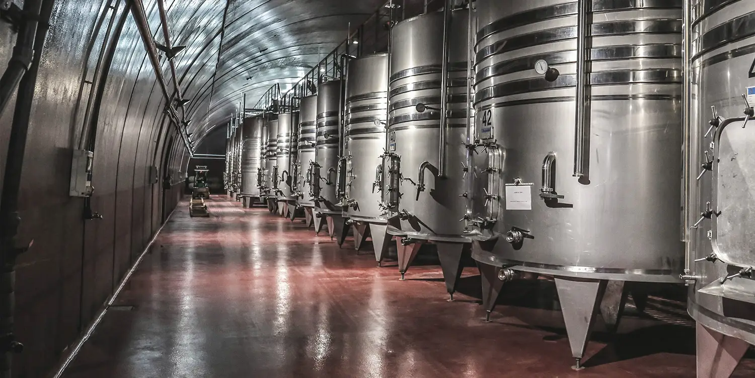
A B2B ordering platform for bars, restaurants and hotels, live in 11 markets across three regions. One ordering flow sits on one multi-brand design system and a shared template, so each market and local brand launches on the same structure instead of building its own. I led design for the ordering experience and the system behind it.

case designsystems 006

Cultural Destination & Development Authority, Middle East

Status: In Progress

A token-based design system for every digital product of a multi-brand destination. Each brand changes the expression, not the structure: components built once and themed per brand, RTL/LTR and light/dark from day one, and an AI-supported Figma-to-code pipeline for token generation and component QA. I lead the system with designers in Dubai and India.

©2026. All rights reserved.

Back to top Arrow